Rachel Victoria Jones
As part of my Unit Two feedback there was a mention of Rachel Jones as one to look at, and it has proven a bit confusing to me as I don’t really understand the reference. Maybe it was casual and I shouldn’t dwell too much, but the rest of the feedback was insightful and thoughtful. The black interiority thing doesn’t seem to have much cross over, although I see there may have been a suggestion I could look into my inadvertent colonial history but I have tried on this hat and it doesn’t interest me directly, right now at least. I’ve learnt to never say never. Being born in a colony wasn’t something I had much choice about nor has it been that emotive for me personally, outside of being the place where other, sometimes terrible things happened. Reading my father’s novel about the Confrontation has been evocative to say the least and I think my heart will reside there forever in some ways.
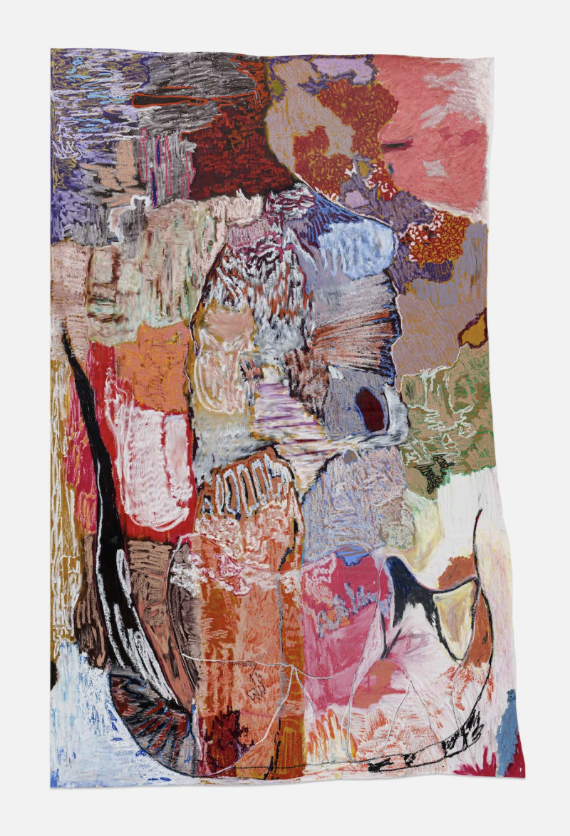
I took the opportunity to see some of Jones’s work when dropping off work at the Pastel Society and popped into the Tate. I spent quite a while contemplating the work and considering where there might be points of reference for me to reflect upon.
In terms of painting I love the oddly not quite straight edges of Jones’s work, which is something I have been looking into for some time. I like how Karl presents his work unstretched and it gives his work a sense of the unfinished, ambiguous. In my own work however the edges feel like a vanity - changing the straightness feels very self conscious and I love the breaking down of paper into a free form fluidity, this doesn’t seem as natural in painting. I like the straight edges of paintings but I do like how Jones’s edges are just a bit off. Noticeably but definitely not distractingly so. So this is something to think about.
The way that Jones paints is definitely of interest I really dislike her drawing, it makes me really uncomfortable, irritable even. Messy and sticky. Not really me. There is sometimes a clarity in the painting though, which I find beautiful. Not head over heels though, by a long shot. Maybe if I put them through a lens of blue and monochrome…!!
I wonder if my comments about a desire to work more like Gommar Gilliams or Dean Fox have prompted this. The saturated colour and gaudy, almost shouty use of colour seems strange to me and I am overall still uncertain of where to file away this feedback. More reflection required!